Hello, Bootstrap
Hello, Bootstrap
Bootstrap is a legendary CSS framework. Born inside Twitter in 2011, this library was one of the first to give developers and designers a way to build clean interfaces rapidly at a time when complex layouts were still very tricky. Bootstrap has features like proportional grids, a plethora of button states, components like drop downs and handy utility classes. It quickly became so popular that it was mocked for its ubiquity.
The framework is even more of a beast in it’s fifth version. This page is built using the framework and it’s designed to give you a taste of what’s on offer, but really we only use a fraction of Bootstrap’s power here and you should also check out the official documentation and examples. It’s really quite remarkable that by adding just one library, you can build a page like this with next to no CSS or JavaScript. You can take a look at how it was built, by opening it up in the editor or using it as a template for a new page.
Bootstrap is a powerful, feature-packed frontend toolkit. Build anything from prototype to production in minutes.
The Hot Page documentation covers the pluses and minuses of using a frontend framework in a page dedicated to the topic. These are powerful tools and they can save a lot of time, especially for beginners. The wide array of off-the-shelf components can be quite tempting.
Hoeever, these libraries run somewhat counter to the Hot Page philosophy of making it easier to write vanilla HTML and CSS. They do a lot of the work for you, but they are not as customizable as doing it yourself and your design freedom will be greatly affected—for better or worse, depending on your skills. Once you want to do something outside of the bounds that their creators envisioned, the large amount of code in the framework can often get in the way and slow you down.
To add Bootstrap to any page on Hot Page, copy and paste the URLs below. The style sheet is added in the Styles tab. And if you want to take advantage of JavaScript components, like the accordion, add the script in the Head tab of your page.
| Asset | URL |
|---|---|
| Style sheet | https://cdn.jsdelivr.net/npm/bootstrap@5.3.0/dist/css/bootstrap.min.css |
| Script | https://cdn.jsdelivr.net/npm/bootstrap@5.3.0/dist/js/bootstrap.bundle.min.js |
Grid and Card
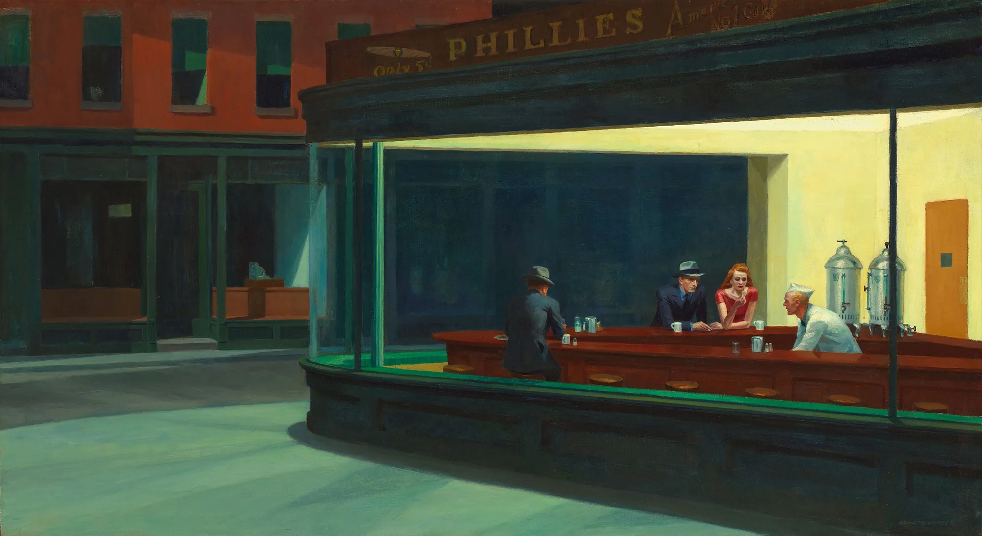
Grids are so pleasing. These cards will show up in rows of three on a tablet or larger screen size. On mobile, they snap out to full width to take up as much of the constrained screen space as possible.
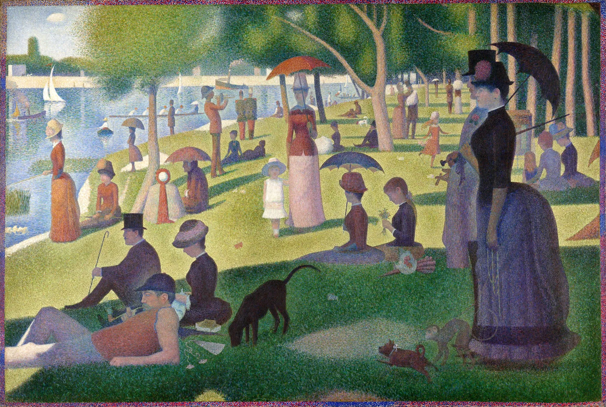
A Sunday Afternoon on the Island of La Grande Jatte
Georges Seurat
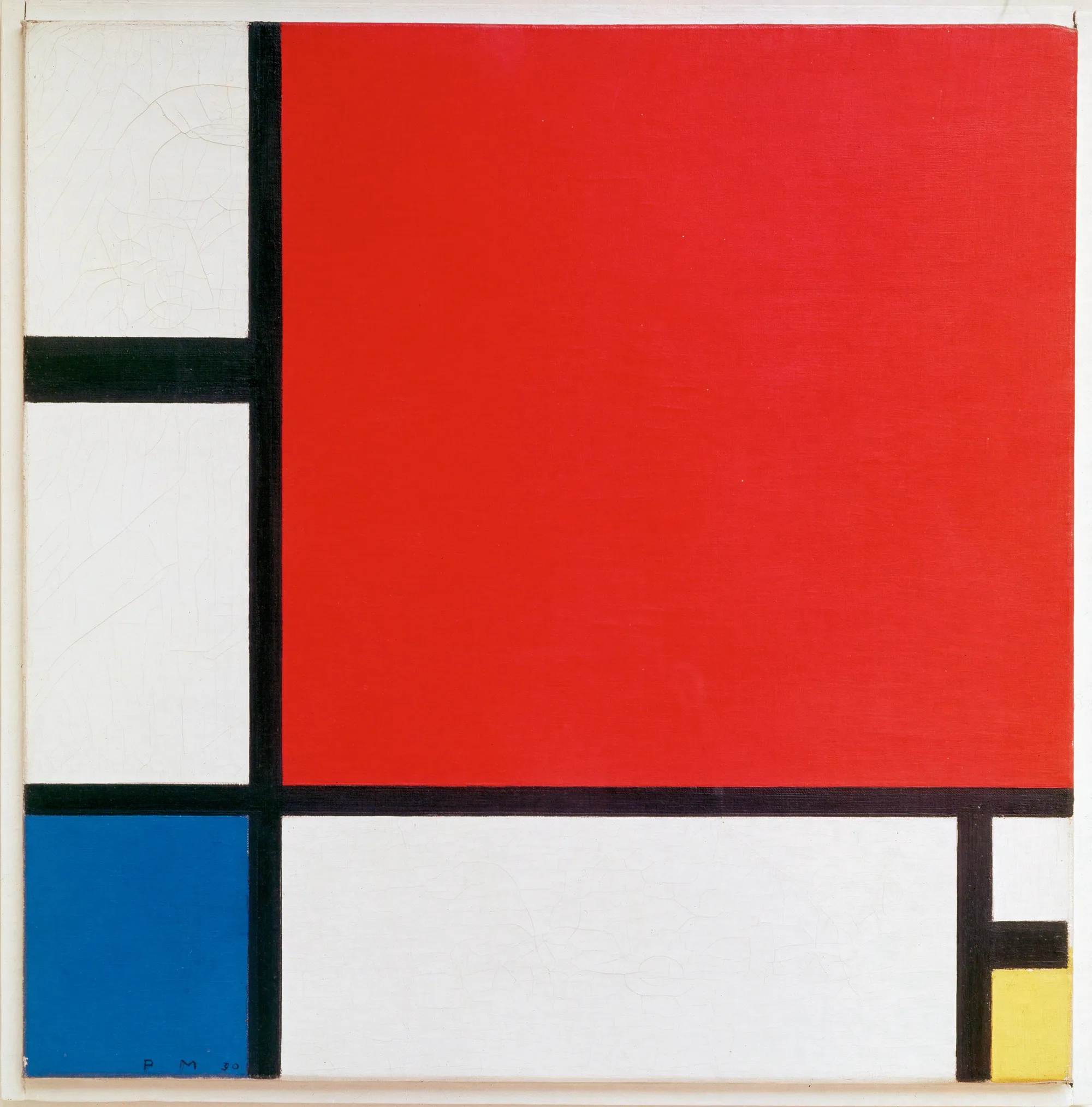
Composition with Red Blue and Yellow
Piet Mondrian
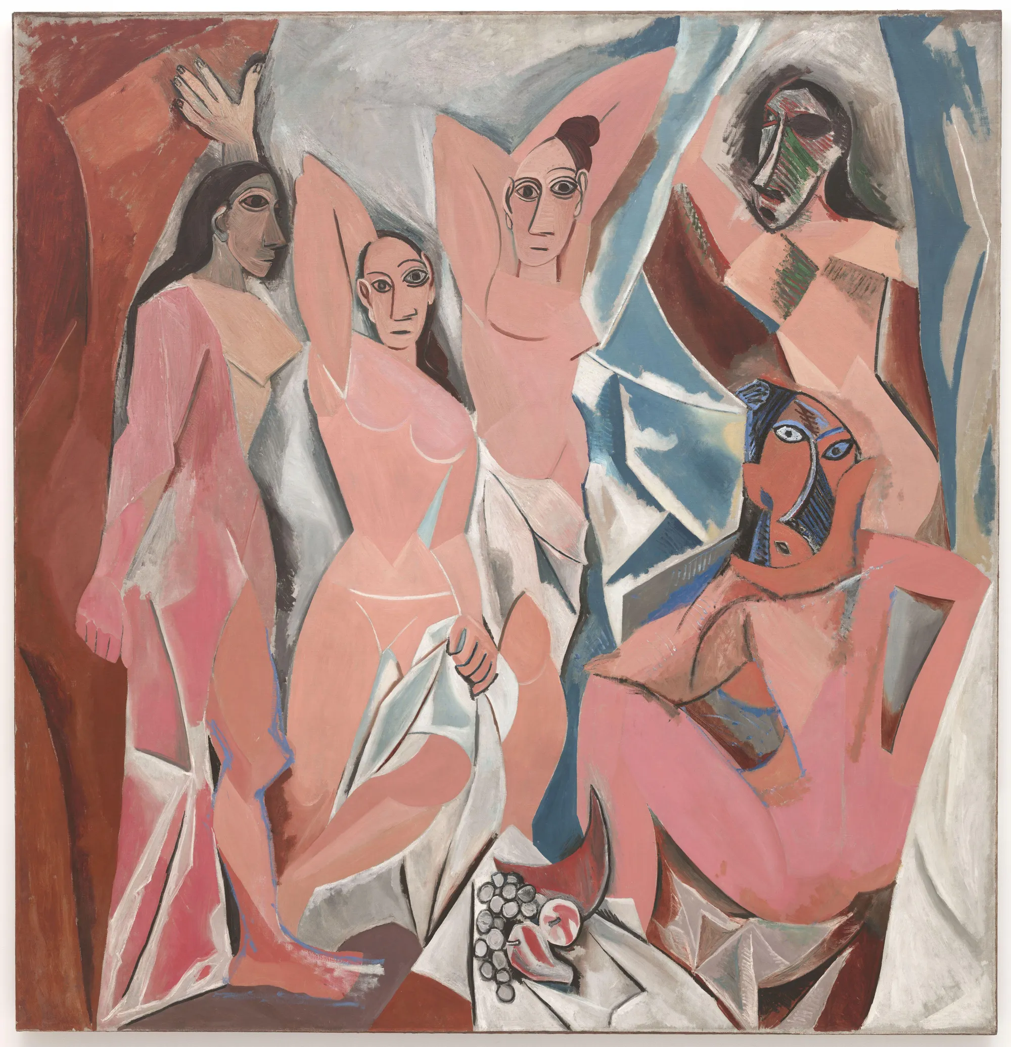
Les Demoiselles d'Avignon
Pablo Picasso
Carousel JavaScript
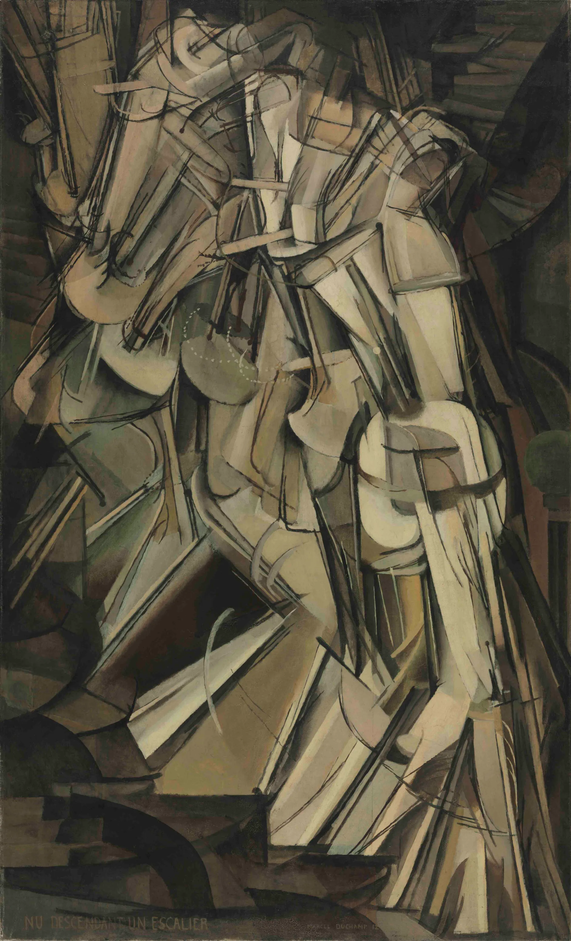
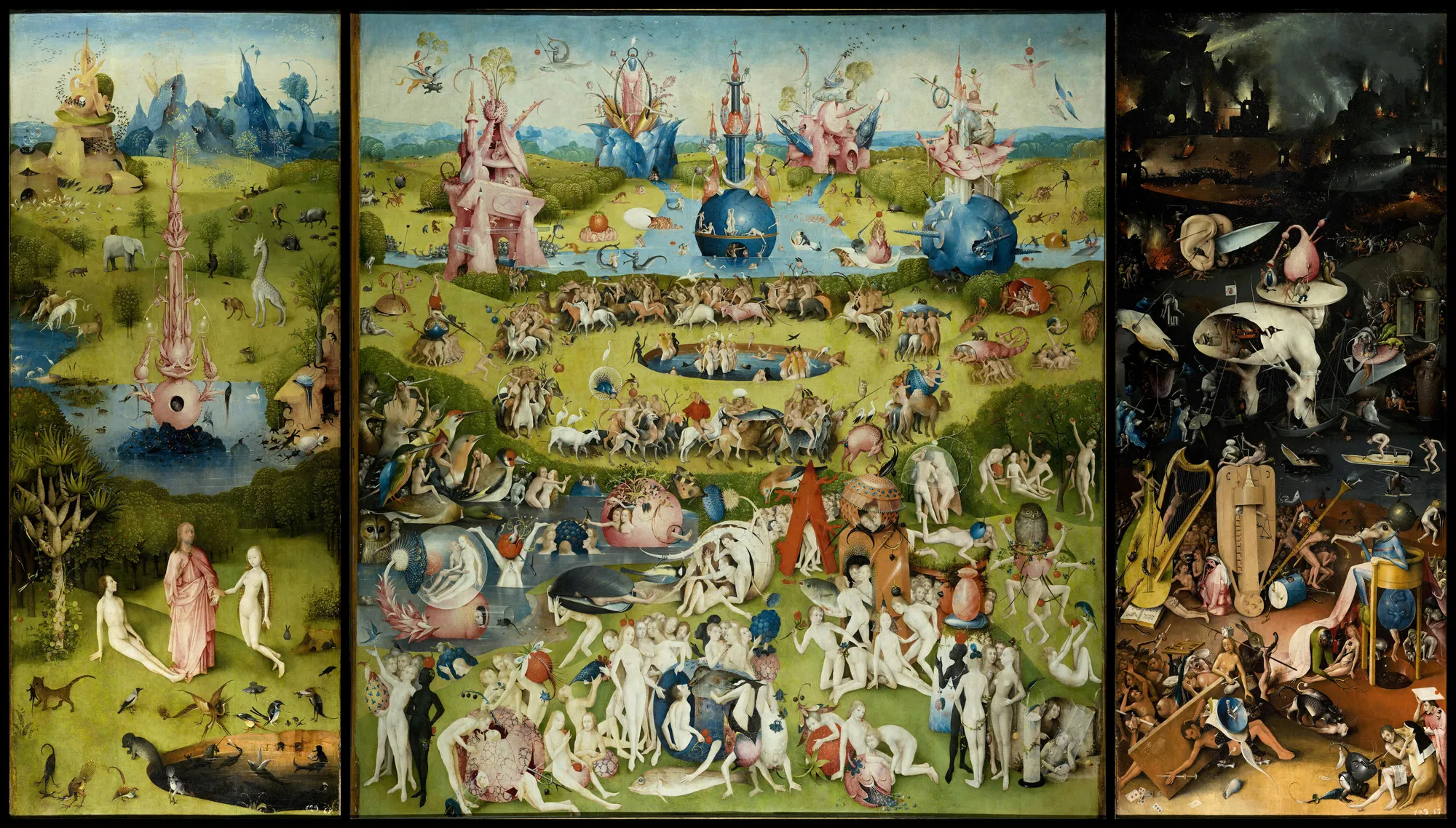
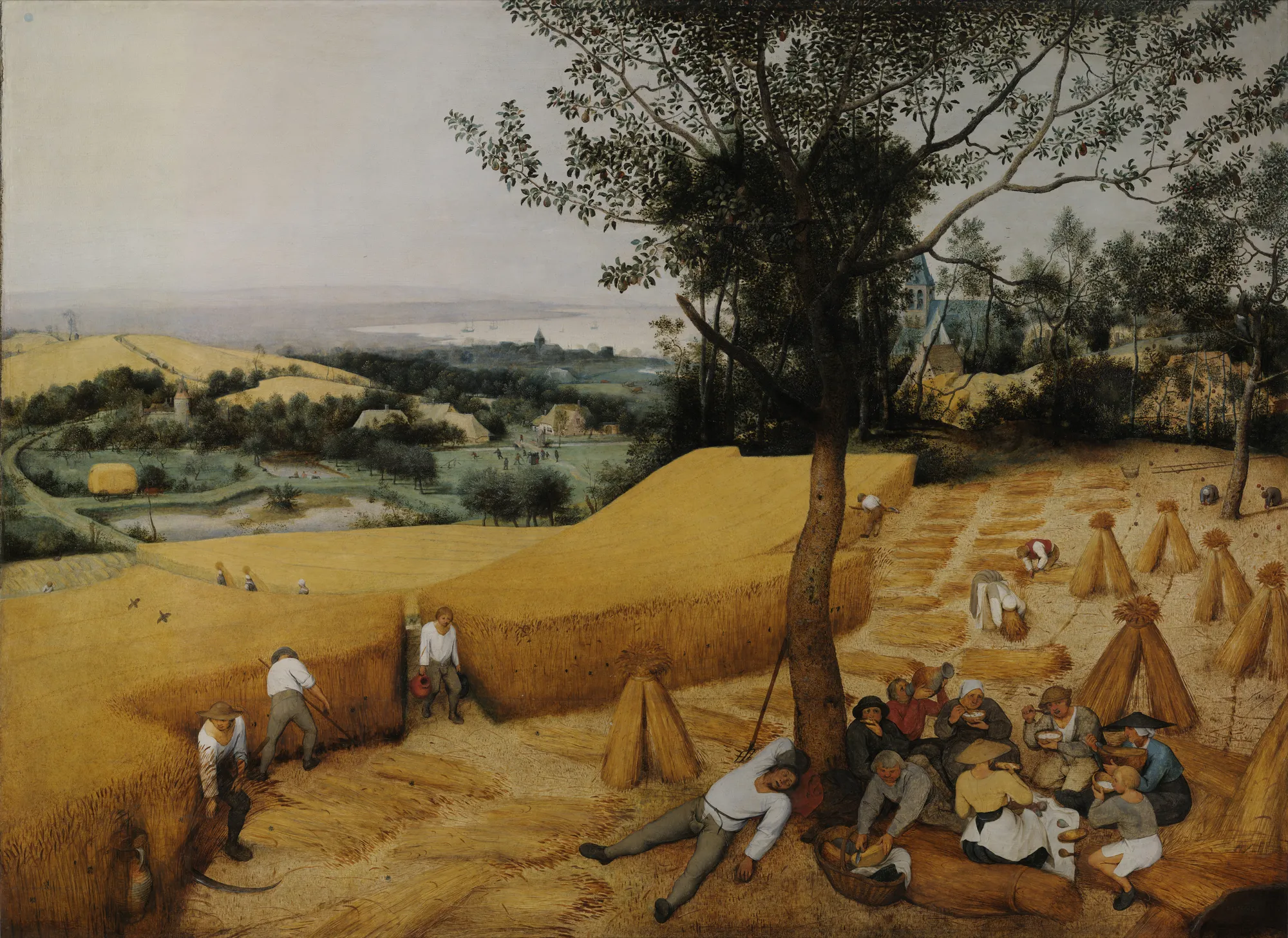
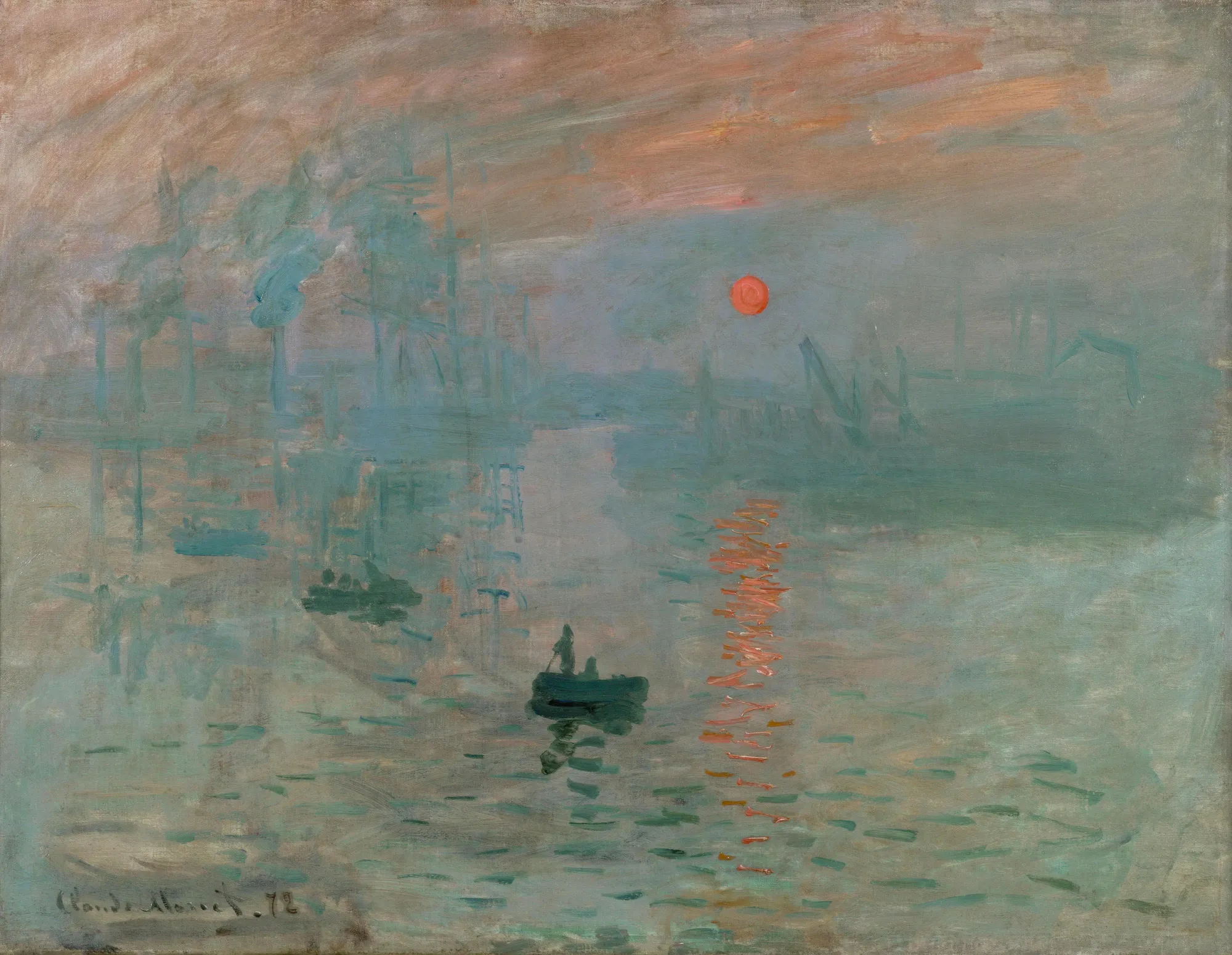
Whether you like them or not, image carousels are everywhere. They’ve become a staple of web design and are plastered over the tops of so many home pages that they’ve become a go-to trope.
The Bootstrap carousel is well built, but it requires you to add your own markup for the surrounding chrome, like the next and previous buttons and the position indicators. For a cleaner approach, consider using a custom HTML element like the Elix carousel.
Components
A simple accordion can really help remove clutter from your page. The components below are most often used for designing web applications, complex interaction with buttons and forms that are built dynamically in JavaScript. That type of thing is probably not the best use case for Hot Page, but have a look if you’re interested.
Forms
Forms are essential for many web applications and even the most basic sites often have a contact form. Bootstrap styles form elements with a cleaner, more attractive look. Here we’re using the “floating labels” feature where the labels like “Name” or “Comments” are shown in the middle of the field when it’s empty and move above once the user enters text.
Showing Off
Here’s something that combines a lot of Bootstrap classes. It’s copy-and-pasted straight from the extensive collection of snippets in the docs
Border hero with cropped image and shadows
Quickly design and customize responsive mobile-first sites with Bootstrap, the world’s most popular front-end open source toolkit, featuring Sass variables and mixins, responsive grid system, extensive prebuilt components, and powerful JavaScript plugins.
