June 12, 2023
Website editors often promise magic. They might say “create any website with flexible design tools and the power of blocks.... customize every detail—no code needed.” Or “create the site you want with 1000s of intuitive design tools” and “AI optimized layouts.”
And, to a certain extent, it’s true: with modern tools, you can throw together a totally decent web site in a matter of minutes. The problem only hits you a few hours later, once you get a bit deeper into the project and you find yourself fighting the limitations of your editor. That trade off between expediency and capability is a core part of the design of any software.
Technology can do incredible things because it employs many layers of abstraction. I can sit in my house in Mexico, type out a message to my mom, and her phone will vibrate in her pocket while she’s in the grocery store halfway around the world. When you stop to think about it, that’s a freaking miracle. My words traveled over fiber optic cables, in and out of data centers in unknown cities and even through the thin air until they appear as light coming off the screen of her phone.
No one person could build anything close to that level of complexity. But we’ve managed to do it collectively by building layers of abstractions. The technology that schedules packets on the internet is pretty much completely separate from the technology that moves that data through the air as radio waves.
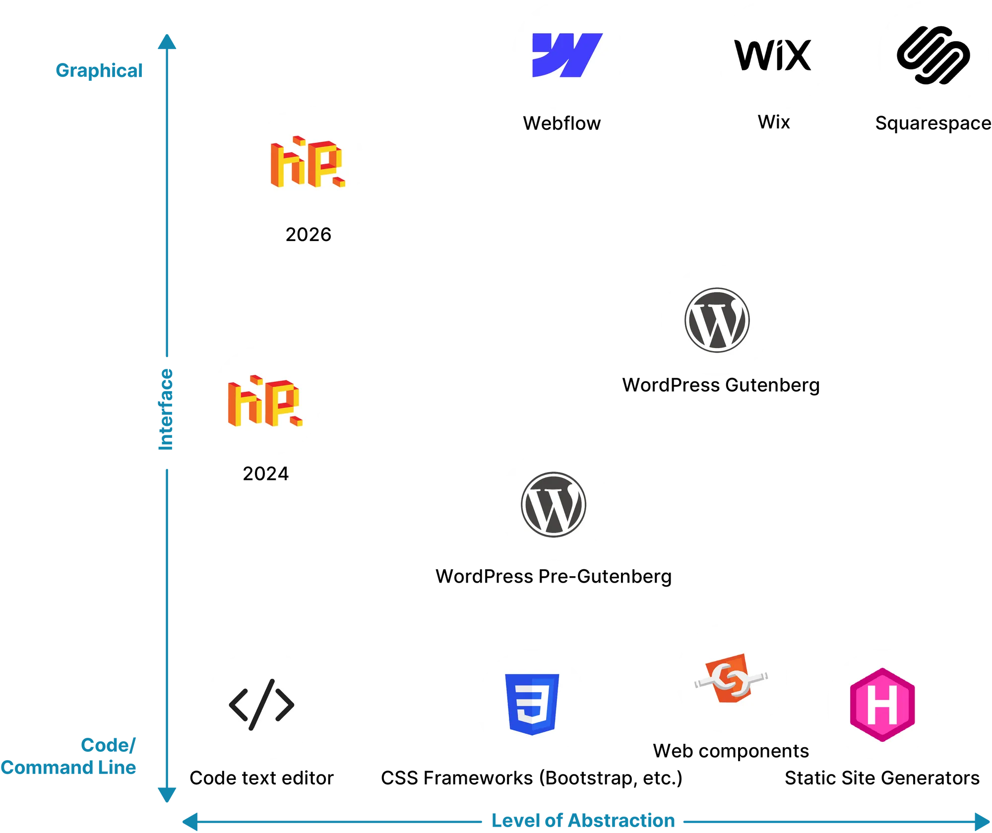
When you use a graphical web editor like Wix, Squarespace or Webflow, you’re using a new layer of abstraction on top of web technologies. You’re not even really building a web page — you’re building a Wix page or a Squarespace page, which is then converted to a web page before it is served to your readers. That has a lot of benefits, but it also has costs.
The biggest benefit is of course that you don’t need to know anything remotely technical to get the job done. This has opened up web development to a whole host of people who might not have the time or inclination to build pages from scratch. That’s an amazing thing and it probably works fine for most projects.
The cost is that when you build a Squarespace web site (or Wix, or Webflow), you are limited to what that platform can do for you. As soon as you want your page to do something outside of the capabilities of that editor, you will have to hack together a fragile solution with no tools to help — or you might even hit a brick wall because it’s not permitted.
Web technologies like HTML, CSS and JavaScript were all specifically designed to be easy for non-techies to learn and use without any prior experience. That’s part of the web’s magic: with a little dedication, anyone can learn to build pages with no tools at all.
Hot Page is meant to be a very thin layer on top of these core web technologies — just enough to smooth out the experience without taking away any of the power and expressive freedom that code allows. Instead of building a no-code editor, we made a more comfortable way to write code with the help of a visual user interface.

The fact that Hot Page uses the base technologies of the web means that it gives you all of the power of the medium. That’s the power to build any web page that you can possibly imagine. In fact, I used it to build the page you’re reading right now, our home page, all of the Hot Page documentation and many other things. (If you want to see how I did it, you can open this page in the editor or any of those using the bookmarklet)
When we expose lower-level technologies, we get another benefit: integrating existing code. On Hot Page, you can use any open source code from anywhere — every CSS framework, custom element, or JavaScript snippet on the Internet. So instead of forcing our idea of image carousel on you, we let you pick and choose from any of the hundreds that have already been built.
Our low-level approach now gives us the benefit of some very powerful existing tools for web development, especially your browser itself and its developer tools. Using “inspect element” is an amazing way to debug your pages and understand how the browser is working at any given moment. Try to do that on Wix or another no-code web site and you’ll just see reams of stuff that’s largely irrelevant to this moment. The ability to “view source” on a web page was once a powerful tool for reverse engineering, but it has lost all meaning in a world where your text content is buried in three or four levels of abstraction.
Perhaps the best part of working with real HTML is that your new skills will be portable. When you get better at Hot Page, you won’t become an expert in the Hot Page way of doing things or the Wix way of doing things, you’ll become an expert in HTML and CSS.
The web platform is growing at an incredible pace. Browsers are implementing new features faster and updates are rolling out to users in a matter of months instead of years. Many things that required web developers to write hundreds or thousands of lines of JavaScript a few years ago can now be handled in a few lines of CSS. Scroll snaps have made image carousels a piece of cake, for instance, and animation timelines make scroll-based effects as easy as any other animation. Best of all, these are usually built using just HTML and CSS in a declarative way that’s less buggy, less fragile, and much faster as their logic can moved off the browser’s main thread.
Guess what? You can use all of those new features on Hot Page today, even though our editor knows nothing about them. That’s because we made it easy for you to write your own CSS, so there’s no need for our editor to understand all the properties you’re using. You’ll also be able to build with the next CSS features as soon as they hit your readers’ browsers (or perhaps even before with the right polyfill).
Web browsers have recently gotten a lovely new layer of abstraction built in: web components. In the past decade, most developers relied on frontend frameworks like React or Angular to build interactivity into web sites, relying on complex build steps and rendering paths along the way. Today, we can use a container for logic that’s a fundamental part of the everything we build on the web, the mighty HTML element. With web components you can add one script to your page and re-use functionality with plain old HTML. Most web sites are largely made of static content and this may be the only abstraction that they really need.
There’s another problem with promising magic: of course it’s never going to be that simple. Layouts are fiddly things and working with them is always going to be somewhat nettlesome, even in Microsoft Word. If it’s not hard, it’s because your tool was built with a layer of abstraction so high-level that you don’t have any real control over the experience (like the content you put on social media).
On Hot Page, I can at least make you a promise that no one else can make: you will be able to figure it out. If your layout isn’t working, it’s because there’s a problem with your CSS and that’s something you will have complete control over — and you also already have more help pages, tutorials and documentation than you could ever read to help you get it right. If your layout isn’t working because of the limitations of WebFlow, well, good luck with that.
The Hot Page way is not for the faint of heart, of course. It might require reading some dense documentation or trying to understand concepts that just wouldn’t apply to a higher-level tool. Learning how things really work can be daunting, but if you’re a builder like me, it will also be damn interesting.